My music magazine will follow the typical narrative structure of a music magazine. This is because I will be able to look at Rock/Indie magazines and see just what they are set out like and just use that to my advantage rather than me trying to break the rules for most of the magazine and having to come up with my own special ideas before I even start it. It will include the normal things such as: sub titles, headlines, different fonts and pictures.
I am planning on to break the rules on my contents page as I have decided that I am going to use one main big picture will take probably half of the page up. This is not usually what happens in a music magazine and I think it will strand out from the rest of the magazines being created as it will be very different. I am planning on getting a group shot of a band which I know or a group of my friends which I have style and putting them into a music studio with instruments around them making it look like they are doing a gig.
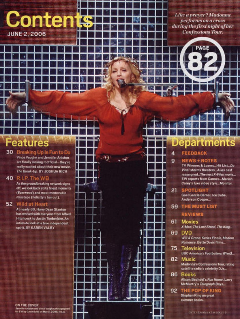
Although that this picture is not in the same place of where I will put it, it is a clear indication on how I am planning on breaking the rules for my contents page. From this picture above it is clear to see that the font has been cleverly placed around this picture when the picture has been sent to the back of the page. The way in which Madonna has her arms in a cross it istantly catches your eye and this is what I want when I create my magazine contents page. The main focus should not be on the picture but of the font around it, but I want an eye catching picture so people will stop and look at this rather than just skip on past this page.
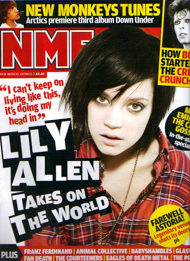
This front cover of the NME magazine is what I want my front cover to look like, hopefully. It follows the everyday house style of this genre by using the colours black, red and yellow (Leeds Festival colours) and also uses bold and straight to the point font. Even though this could be seen as boring, it appears a lot more readable as it is bold rather than it being in such fancy writing with different colours all over the cover.
Also, in addition to this, I want to put a quote on the front cover of my magazine just like this one has done as it looks like there has been an interview with a celebrity and it will make more people want to read ahread to this page with the quote. Just like this cover I will make sure that the font of this quote is very eye catching rather than just hid away at the bottom of the page.

As this genre is very famous and well known within so many generations it is normal that there is a band on the front cover in some sort of studio. Above is a studio shot of a well known band called Kasabian and this picture has been taken in a music studio. This is evident by the background and the guitar shown infront of their lead singer. In my magazine, hopefully I will use a band which will follow these normal rules as it is very poweful in a way which catches people's eye. Serge is looking straight into the camera on this picture which instantly draws you in and makes you want to look at this magazine more as it is using direct address and involving you straight away. This is an advantage which I might use whilst taking pictures in my studio shot.
No comments:
Post a Comment